In this article,
I want to make my design studio more stylish, but I'm not sure what to do..."
I want to work in a stylish place with pictures!
We will show you 10 characteristics of a stylish design studio along with simulation photos of a room with pictures hanging in it.
By seeing how they are actually decorated, it may be easier to imagine how they would look hanging in your own store.
So, what exactly are the characteristics of a fashionable design studio?
(1) Low color count
In fashionable interiors, regardless of style, they all create coolness by playing with a limited number of colors.
It is also important to know what kind of art to place in them.
Although they are decorations, they can be made to fit naturally into the interior by devising "where to place them".
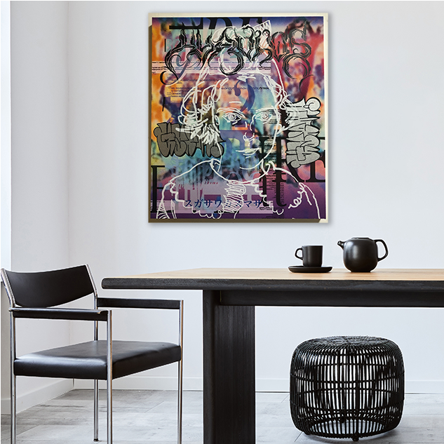
Girl (Going over Bonnard) by by Kazumasa Sugasawa
W 45.50cm x H 53.00cm / ¥80,000
(2) Add a playful element
If you only use a tense, staid design, your shoulders will probably stiffen.
By adding a little playfulness to the design, it is possible to create a space with creativity.
Wall paintings are perfect as a single point of interest that will raise the creativity of your studio.
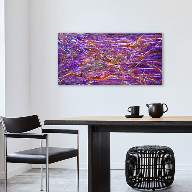
Very Peri Dreams II by Olga de Weck
W 60.00cm x H 30.00cm / ¥49,900
(3) Special lighting
By properly using pendant lights, floor lights, down lights, spotlights, etc., you can control the areas you want to be softly and dimly lit and the areas you want to cast crisp shadows.
Depending on the lighting, even an abstract painting such as the one in the image below can look very different.
Please consider different lighting options.
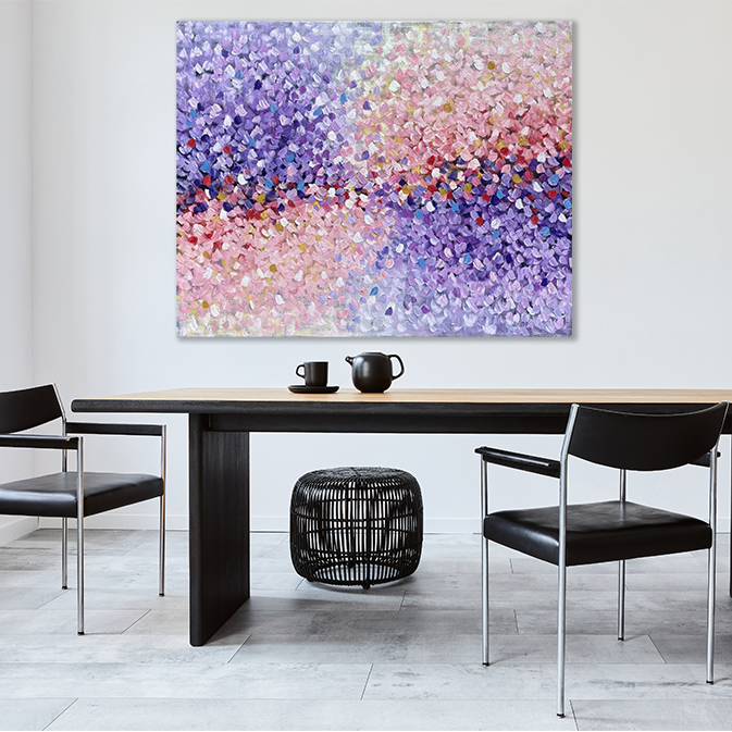
A Love Everlasting 2 by Belinda Nadwie
W 152.00cm x H 122.00cm
4) Slender items
Adding slim and slender items can create a sophisticated effect at once.
A sense of stylishness can lead to a sense of femininity, and aiming to coordinate like a chic woman will create a space with a sense of style typical of a design studio.
Simplicity can be emphasized by thin items, and conversely, wall-hung paintings can bring a patterned element.
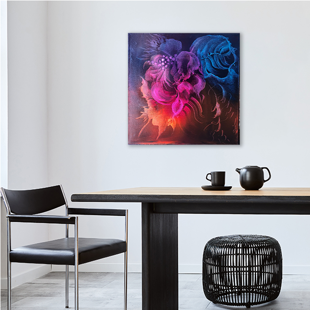
Flowers talk I by Ludmila Budanov
W 40.00cm x H 40.00cm / 33,500Yen
5) Combination of inorganic and organic qualities
Furniture such as tables, chairs, whiteboards, and shelves emphasize a modern inorganic quality with prominent verticals and corners.
In contrast, adding organic momentum with paintings and three-dimensional works of art can balance the two just right.
In this way, endless combinations can be created, and it can be fun to change interiors on a regular basis.
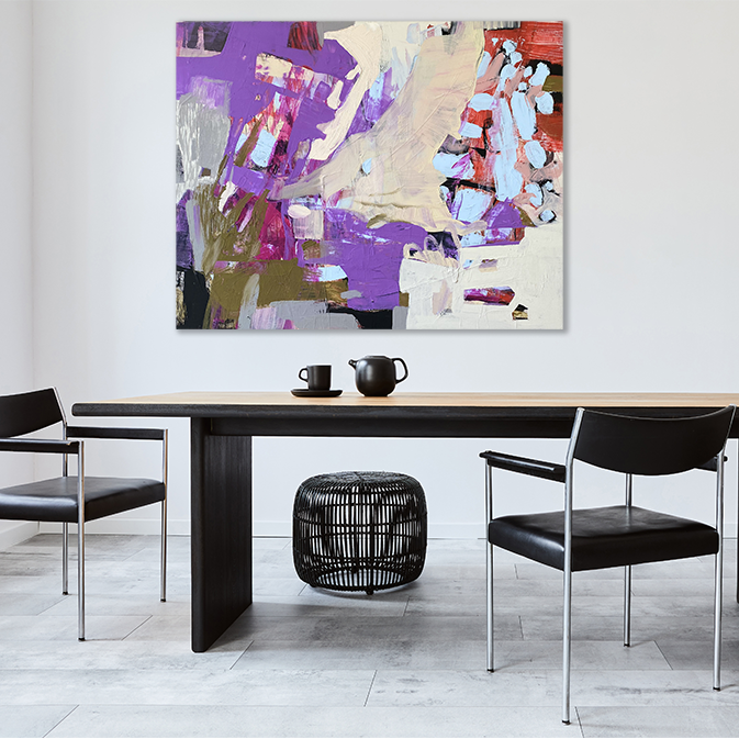
PopU by Evgeniya Zolotareva
W 110.00cm x H 90.00cm|¥214,300
(6) How to make the most of the blank space
In a design studio, we recommend that you design with an awareness of the shape of the space where things are not placed (negative space), because it requires a more sophisticated impression than ordinary interiors.
Negative space on the floor is a conduit, and the more frequently people come and go in a studio, the more productive it will be.
The more space you have, the simpler it is, and the more you can focus on what is important.
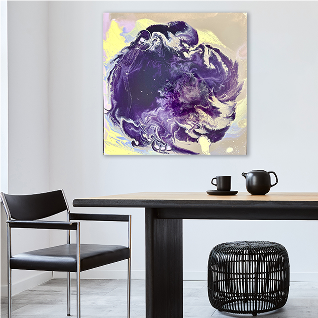
Desert rose 2/2 diptych by Hodaya Levin
W 50.00cm x H 50.00cm|¥107,100
7) Utilize Italian modern
Italian modern style is a style in which the base is a monotone color and a limited number of items in primary colors such as vivid blue, red, and green are placed.
It can create quite a unique atmosphere.
Although you may be hesitant to purchase, you can imagine what it will look like by trying out the simulation with images or ordering a catalog.
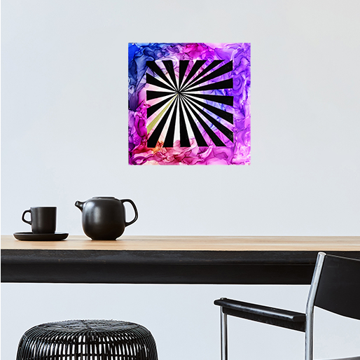
Focal point by Mohita Garg
W 17.70cm x H 17.70cm|19,400Yen
8) Utilize Scandinavian Modern
Scandinavian Modern is a style that maintains the basic Scandinavian style of white tones and a gentle atmosphere with natural motifs, but creates a modern, tense atmosphere by using monotone colors and thin items.
This style is popular among many Japanese people because it is stylish but also warm and inviting.
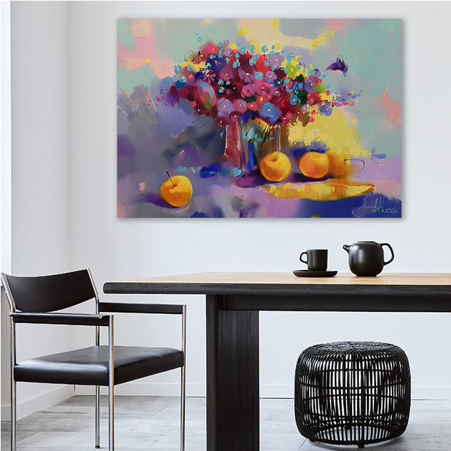
Bouquet of flowers by Novikov Mykhailo
W 70.00cm x H 50.00cm / ¥50,900
(9) Decorate with clocks
In addition to art, clocks are also part of wall decorations.
It is appropriate to display them neither too close to the ceiling nor too close to the floor, but a little above a woman's line of sight.
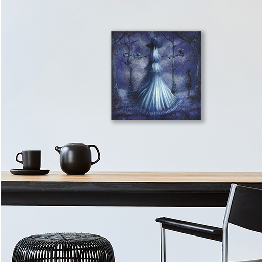
Scarecrow by Joanna Viheria
W 20.30cm x H 20.30cm / ¥67,000
(10) Secure a line of sight
A space where something is not placed is a space for people to pass through. Leading lines are directly related to productivity.
It will also have an impact on Feng Shui. Please find out what colors are good feng shui by placing things in the north, south, east, and west.
It may also affect your own financial and life luck.
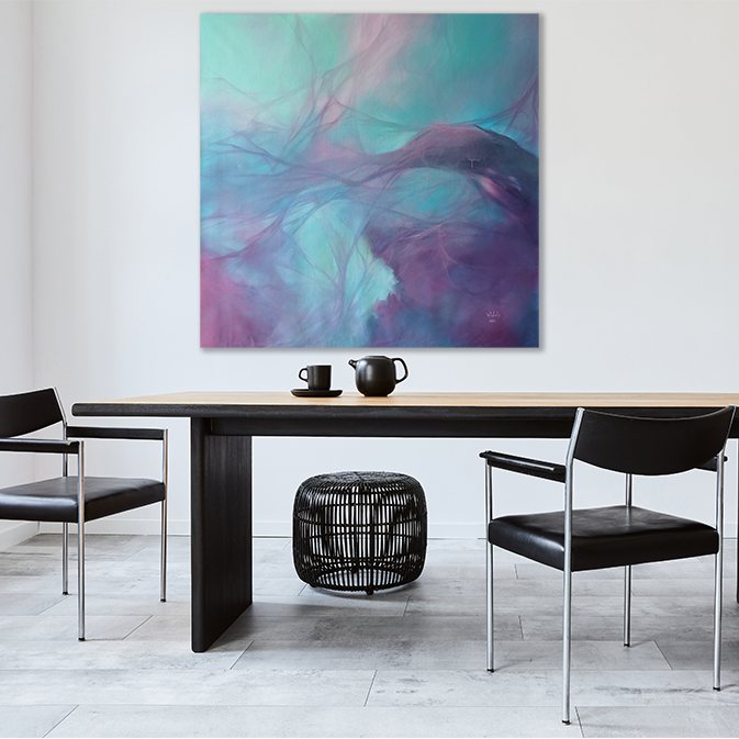
Purple №2 by Vasyl Kolodiy
W 100.00cm x H 100.00cm|¥132,000
View TRiCERA ART's latest works
TRiCERA ART members enjoy a variety of privileges and preferences.
- Discounts such as members-only secret sales and coupons
- Create your own collection by registering your favorite artists
- Receive updates on popular artists, exhibitions, and events
- Receive a weekly newsletter with selected art
- Personal Assessment to find out what kind of art you like.
Please register as a member for free and receive the latest information.
Free Member Registration