
CURATOR’s EYE
3 minutes Art -Nori Yamamoto-
Instagram에서 TRiCERA를 팔로우하고 크리에이티브 아티스트를 확인하십시오.
5%OFF & 무료배송 1차구매
FIRSTART5
10%OFF 첫 구매 후 두 번째 구매 시!
TRiCERA에 오신 것을 환영합니다
Hi there! 만나뵙게 되어 반갑습니다 🎉
자기소개를 부탁드립니다.
손님
 (Space Cloud - 8th Planet / 70cm×100cm / digital print)
The colors of the changing sky, which will soon become night, are beautiful and give this work of art a very nostalgic atmosphere. As the motif is nature, the orange color of the clouds covering the sky blends well with the vintage wooden interior. Because it is a digital print, the clouds and other details are reflected in great detail, making it an eye-catching presence even in a simple room.
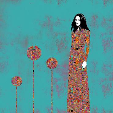 (Lover/80cm×80cm/pigment)
The overall composition of this work is solid and simple, but it uses pigments, and the skirt the woman is wearing and the plant-like pattern next to it is an interesting, complex mosaic pattern. The background has a faint expression like a grunge texture, so it doesn't look brand new and is perfect for a retro atmosphere. In a mid-century space, it will not look out of place when introduced into a room because of its affinity with simple designs like the poster. The image of a woman standing dignifiedly with both eyes closed and the subdued color scheme also suggests a mature and modern taste.
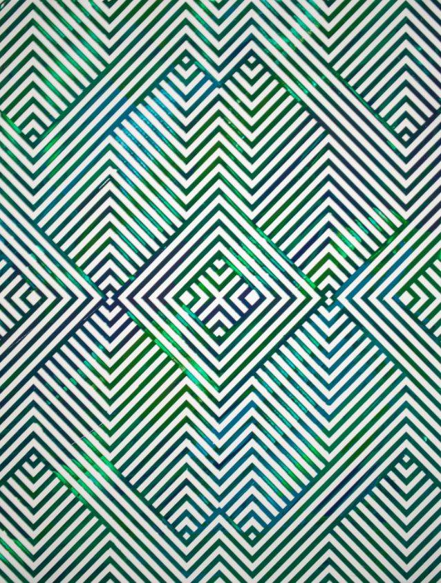 (A.I./30.4cm×40.6cm/acrylic)
This artwork is characterized by beautiful geometric patterns that fill the screen. The geometric patterns are simple, but they easily create a modern space. The entire painting is done in green, which goes well with wooden interiors and mid-century rooms that tend to have a lot of dark browns. The green color is subtly varied, and the effect of the acrylic, which seems to glitter, also gives the impression of a new material, which is one of the elements of mid-century. By not biasing the textures present in the room, the quality of the room's interior will be improved.
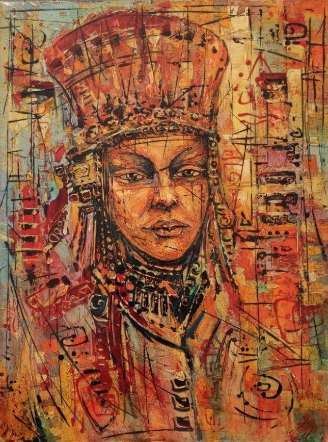 (Portrait No. 3 / 80cm x 60cm / acrylic)
This portrait is painted with a unique ethnic touch, and uses a technique called matiere, which is based on the raising of paint. The ethnic elements tend to give a warm, vintage impression, and are often used to create mid-century spaces. Artwork with large faces can be difficult to introduce into a room, but this piece has a soft expression with a distant gaze, so it is not overpowering. If you are still concerned about it, you can reduce the impression of the face by displaying smaller pieces around it.
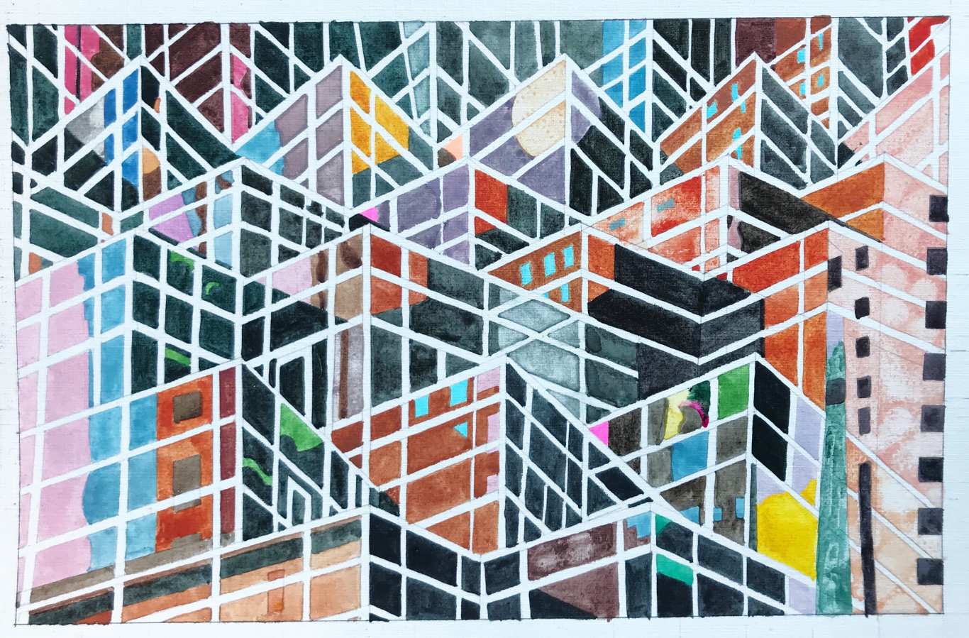 (New York City / 35.6cm×48.3cm / watercolor, pen and ink)
This work is unusual in that it depicts the buildings of New York City in a design sense, making good use of straight lines, and using colorful colors to express the buildings, rather than using a standard color such as gray. The lines alone look like a geometric pattern, but the reflection of the moon, the sky, and the buildings across the street are uniquely depicted in the building. The New York cityscape, which is European and American, and the simple design of the artwork go very well with mid-century.
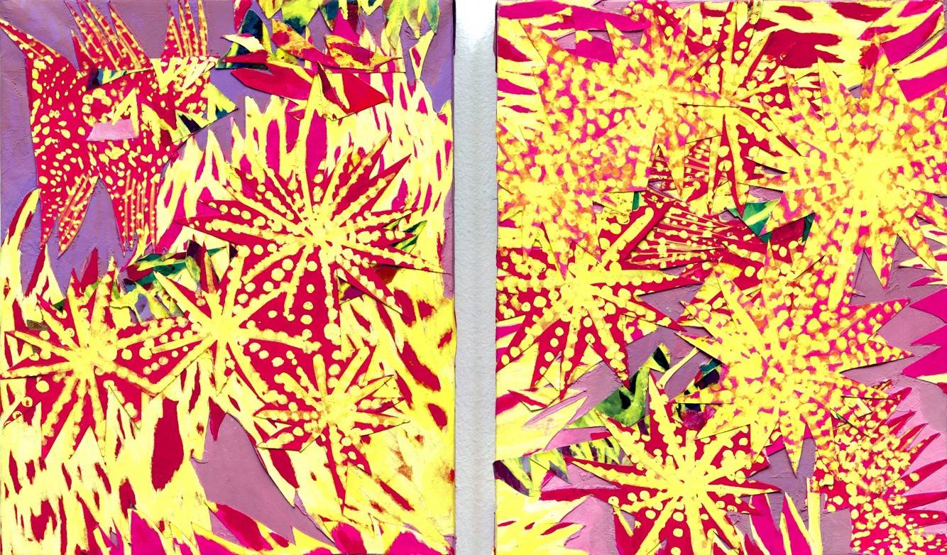 (Festival 3/27cm×44cm/Korean Colos)
.
This is a work of art in which the vivid reds and yellows fill the screen, creating a strong impact. The artist, Hanhyoni, has a powerful sensibility in this work, which depicts "the various fragments of life that make up the world. In mid-century, rooms are often unified in a calm dark tone. The two pieces come as a set, so you can display them side by side or asymmetrically.
작가
Manami Yoneda
 (Space Cloud - 8th Planet / 70cm×100cm / digital print)
The colors of the changing sky, which will soon become night, are beautiful and give this work of art a very nostalgic atmosphere. As the motif is nature, the orange color of the clouds covering the sky blends well with the vintage wooden interior. Because it is a digital print, the clouds and other details are reflected in great detail, making it an eye-catching presence even in a simple room.
 (Lover/80cm×80cm/pigment)
The overall composition of this work is solid and simple, but it uses pigments, and the skirt the woman is wearing and the plant-like pattern next to it is an interesting, complex mosaic pattern. The background has a faint expression like a grunge texture, so it doesn't look brand new and is perfect for a retro atmosphere. In a mid-century space, it will not look out of place when introduced into a room because of its affinity with simple designs like the poster. The image of a woman standing dignifiedly with both eyes closed and the subdued color scheme also suggests a mature and modern taste.
 (A.I./30.4cm×40.6cm/acrylic)
This artwork is characterized by beautiful geometric patterns that fill the screen. The geometric patterns are simple, but they easily create a modern space. The entire painting is done in green, which goes well with wooden interiors and mid-century rooms that tend to have a lot of dark browns. The green color is subtly varied, and the effect of the acrylic, which seems to glitter, also gives the impression of a new material, which is one of the elements of mid-century. By not biasing the textures present in the room, the quality of the room's interior will be improved.
 (Portrait No. 3 / 80cm x 60cm / acrylic)
This portrait is painted with a unique ethnic touch, and uses a technique called matiere, which is based on the raising of paint. The ethnic elements tend to give a warm, vintage impression, and are often used to create mid-century spaces. Artwork with large faces can be difficult to introduce into a room, but this piece has a soft expression with a distant gaze, so it is not overpowering. If you are still concerned about it, you can reduce the impression of the face by displaying smaller pieces around it.
 (New York City / 35.6cm×48.3cm / watercolor, pen and ink)
This work is unusual in that it depicts the buildings of New York City in a design sense, making good use of straight lines, and using colorful colors to express the buildings, rather than using a standard color such as gray. The lines alone look like a geometric pattern, but the reflection of the moon, the sky, and the buildings across the street are uniquely depicted in the building. The New York cityscape, which is European and American, and the simple design of the artwork go very well with mid-century.
 (Festival 3/27cm×44cm/Korean Colos)
.
This is a work of art in which the vivid reds and yellows fill the screen, creating a strong impact. The artist, Hanhyoni, has a powerful sensibility in this work, which depicts "the various fragments of life that make up the world. In mid-century, rooms are often unified in a calm dark tone. The two pieces come as a set, so you can display them side by side or asymmetrically.
작가
Manami Yoneda